
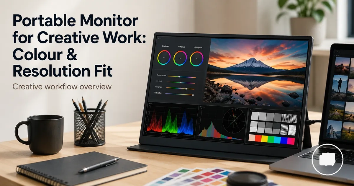
Portable monitors for creative work and creator workflows
A portable monitor is an external portable display that can extend a creator workflow beyond the main laptop or device screen. In creative work, the decision is not only whether a portable monitor adds screen space, but whether it supports the right balance of colour accuracy, resolution, panel type, workspace, and compatibility for the intended task.
Creative work often involves different screen demands for photo review, design layouts, illustration, video editing, client presentations, or reference material. A portable monitor may help keep tools, timelines, or source content visible while leaving the primary display focused on the main project. The value of a second screen depends on colour accuracy, resolution, workflow fit, and compatibility with the source device.
Generic monitor advice may not be enough for creator workflows because panel type, screen size, calibration, viewing conditions, and available device outputs can influence the overall experience. A portable monitor can support creative review and editing, but it should not be treated as a universal replacement for a calibrated reference display when colour-critical decisions require greater consistency.
The portable monitor guide provides broader category guidance, while this page focuses on creative-work decision making. The following sections explain how creator workflow requirements, display attributes, and practical compatibility can help determine whether a portable monitor suits a specific workspace.
Where a portable monitor fits in creative work
Creative work often benefits from a portable monitor when the workflow needs a second screen for visual references, editing panels, or review tasks alongside the primary project. The practical fit depends on how the display supports laptop pairing, available workspace, and the type of creative task rather than simply adding another screen. This creates a balance between additional workspace and the limits of the specific workflow.
Where a portable monitor fits in creative work becomes clearer when viewed in a realistic workflow. The image below illustrates how a second screen can extend the workspace for creative tasks without implying that it replaces every display requirement.
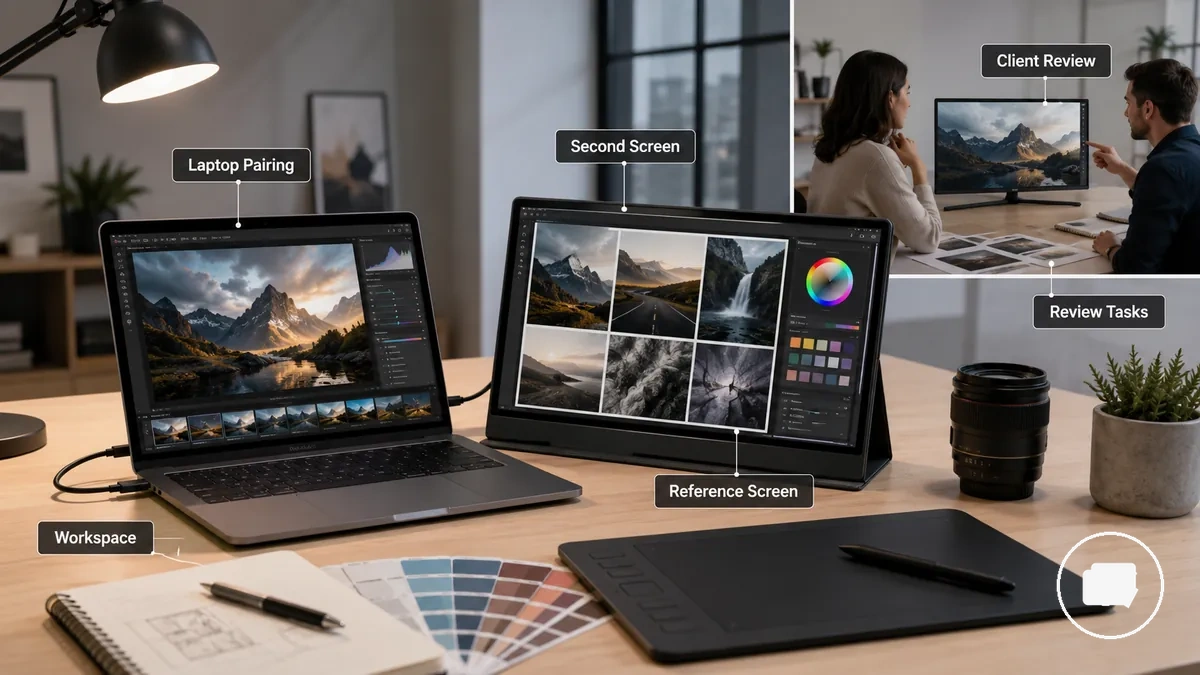
When editing software, reference material, and preview windows compete for space on a single display, a second screen can reduce workflow friction by separating supporting content from the main canvas. This arrangement may suit a desk setup, studio setup, or client review session where extra viewing space improves organisation. It may be less useful when the workflow depends on a fixed calibrated reference screen or a larger desktop monitor for colour-critical evaluation.
Where a portable monitor fits in creative work depends on the task, location, and review needs. Use the following checklist to judge whether it matches your workflow before comparing display specifications.
- Supports creative work well as a second screen for reference material, editing panels, or timelines.
- Confirm laptop pairing so the source device supports the required display connection and power arrangement.
- Consider available desk setup or studio setup space before adding another display.
- Workspace mobility can add value when creative projects regularly move between locations.
- Review tasks and client review sessions may benefit from an additional viewing screen.
- May be less useful when colour-critical work requires a fixed calibrated reference screen or a larger desktop monitor.
Creative tasks that change portable monitor requirements
Creative tasks determine which portable monitor requirements deserve the highest priority. Photo editing, design work, illustration, video editing, review work, and reference-screen use do not rely on the same display attributes, so the most suitable choice depends on the task rather than a single specification.
As creative tasks become more colour-sensitive or workspace-intensive, portable monitor requirements usually become more demanding. Colour-critical work may place greater emphasis on colour accuracy, while layout-focused and timeline-based workflows may benefit more from resolution, scaling, brightness, and available workspace. The comparison below organises how creative tasks change portable monitor requirements without implying that one display profile suits every workflow.
Requirements may also vary according to software, source device, and output expectations. The table below maps each task to the display attributes that are typically worth prioritising.
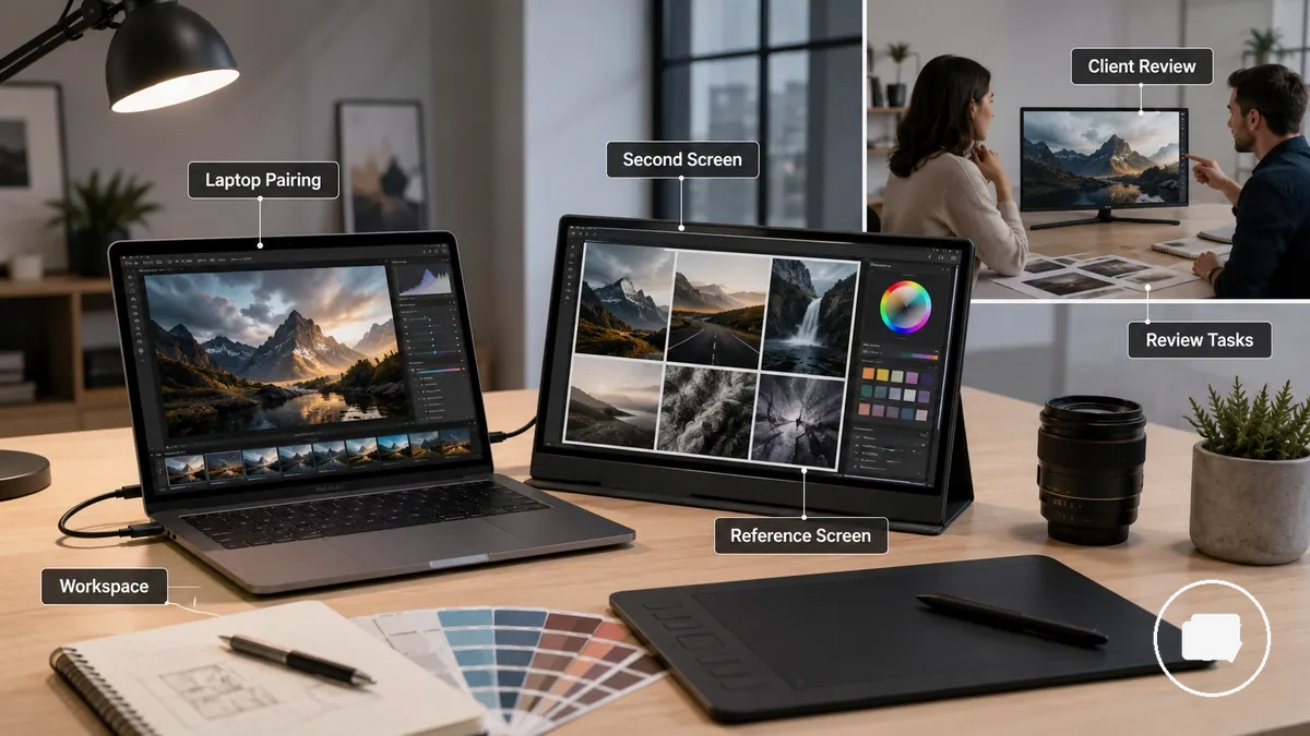
Creative tasks that change portable monitor requirements become easier to compare when each workflow is matched with its primary display priorities.
| Task type | Main display requirement | Useful portable monitor attribute | When to prioritise it |
|---|---|---|---|
| Photo editing | Colour accuracy and consistency | Accurate colour reproduction with suitable resolution | When editing decisions depend on faithful colour presentation |
| Graphic design | Workspace and readable layouts | Resolution and effective scaling | When managing typography, layouts, or multiple design panels |
| Illustration | Visual detail and colour control | Balanced resolution with dependable colour accuracy | When artwork refinement depends on clear visual feedback |
| Video editing | Timeline visibility and preview space | Larger workspace with practical scaling | When editing interfaces compete for screen space |
| Client review | Clear on-screen presentation | Suitable brightness for viewing conditions | When presenting creative work for discussion or feedback |
| Reference-screen use | Supporting material beside the main display | Additional workspace with practical resolution | When keeping references visible during creative work |
Photo editing and colour review
Photo editing and colour review usually require stronger colour consistency than many other creative tasks. Small differences in tone, contrast, and detail can influence editing decisions, so repeatable visual results become more important than simply adding a second screen. This creates a higher colour-review burden throughout the editing process.
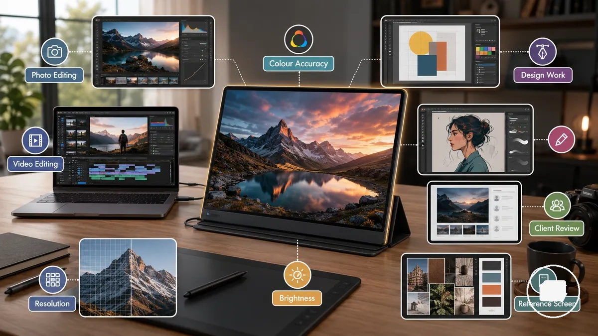
RAW editing, proof review, skin tones, and shadow detail often require closer visual inspection because subtle adjustments may appear differently across displays. Colour space support, calibration readiness, and screen-to-screen consistency can become more important when comparing a portable monitor with a laptop display, although results still depend on the displays and workflow. Photo editing and colour review depend on repeatable colour and detail checks, while casual previewing or client presentation can usually tolerate more variation than serious colour judgement.
Photo editing and colour review benefit from checking the following display characteristics before relying on a portable monitor for colour-sensitive work:
- Confirm that the display supports the colour space used by your editing workflow.
- Consider calibration readiness if consistent colour review is an ongoing requirement.
- Check whether shadow detail remains visible during image adjustments.
- Review skin tones for natural and consistent appearance across editing sessions.
- Compare screen-to-screen consistency with the laptop display when moving between screens.
Graphic design and layout work
Graphic design and layout work often benefits from a portable monitor when extra canvas space and room for UI panels make projects easier to manage. Keeping the design canvas on one screen and supporting tools on another can improve layout clarity, although the result still depends on screen size, aspect ratio, and software scaling. The main display fit comes from balancing canvas space, typography visibility, and UI panels.
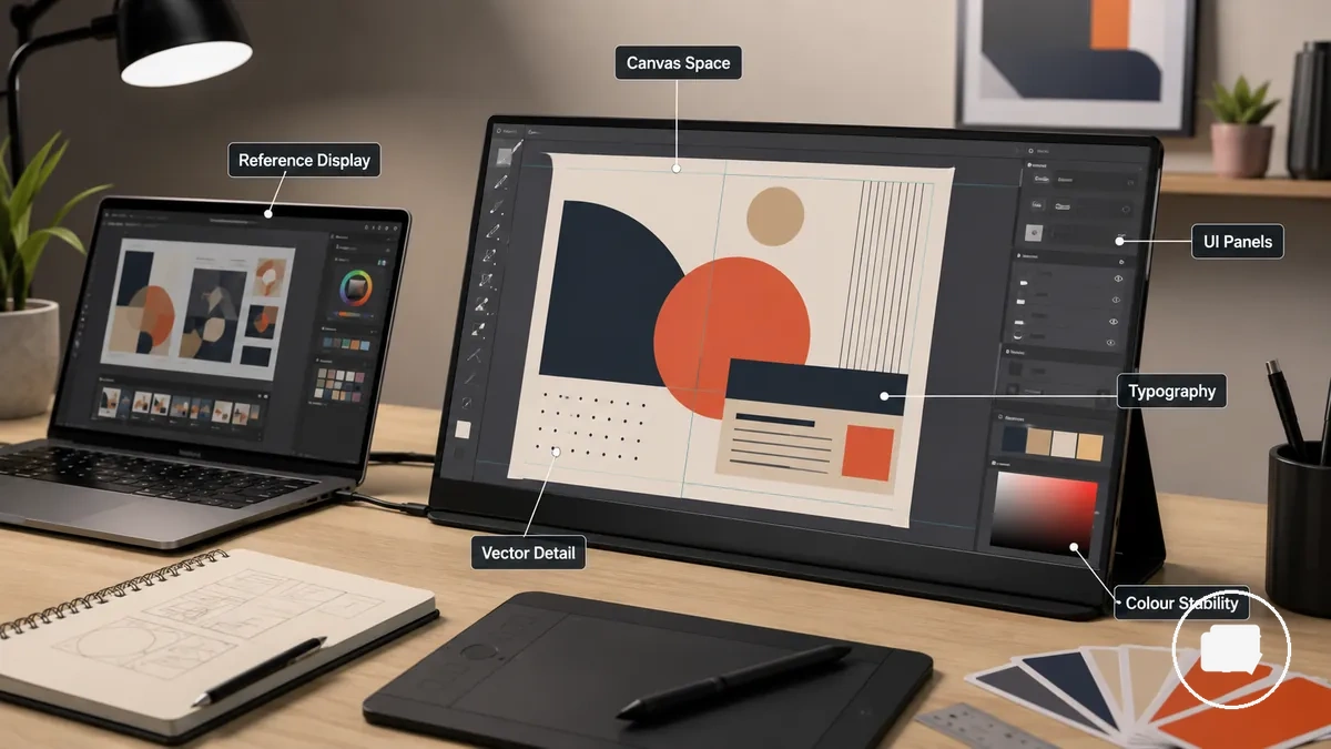
Scaling, typography visibility, vector detail, and colour stability can influence how comfortably a design project is created and reviewed. A portable monitor may support design production by providing more layout room, while a reference display or presentation review often focuses on visual communication rather than detailed editing. Graphic design and layout work depends on workspace clarity and scaling checks, so the following points are worth reviewing before relying on a second screen:
- Check that canvas space and UI panels remain comfortable without reducing the main design area.
- Confirm typography visibility and scaling remain easy to read at the selected screen size and aspect ratio.
- Review vector detail to ensure shapes, lines, and interface elements stay clear during design production.
- Consider colour stability when moving between the laptop display and the portable monitor, especially when the second screen is used as a reference display rather than for presentation review.
Video editing and timeline workspace
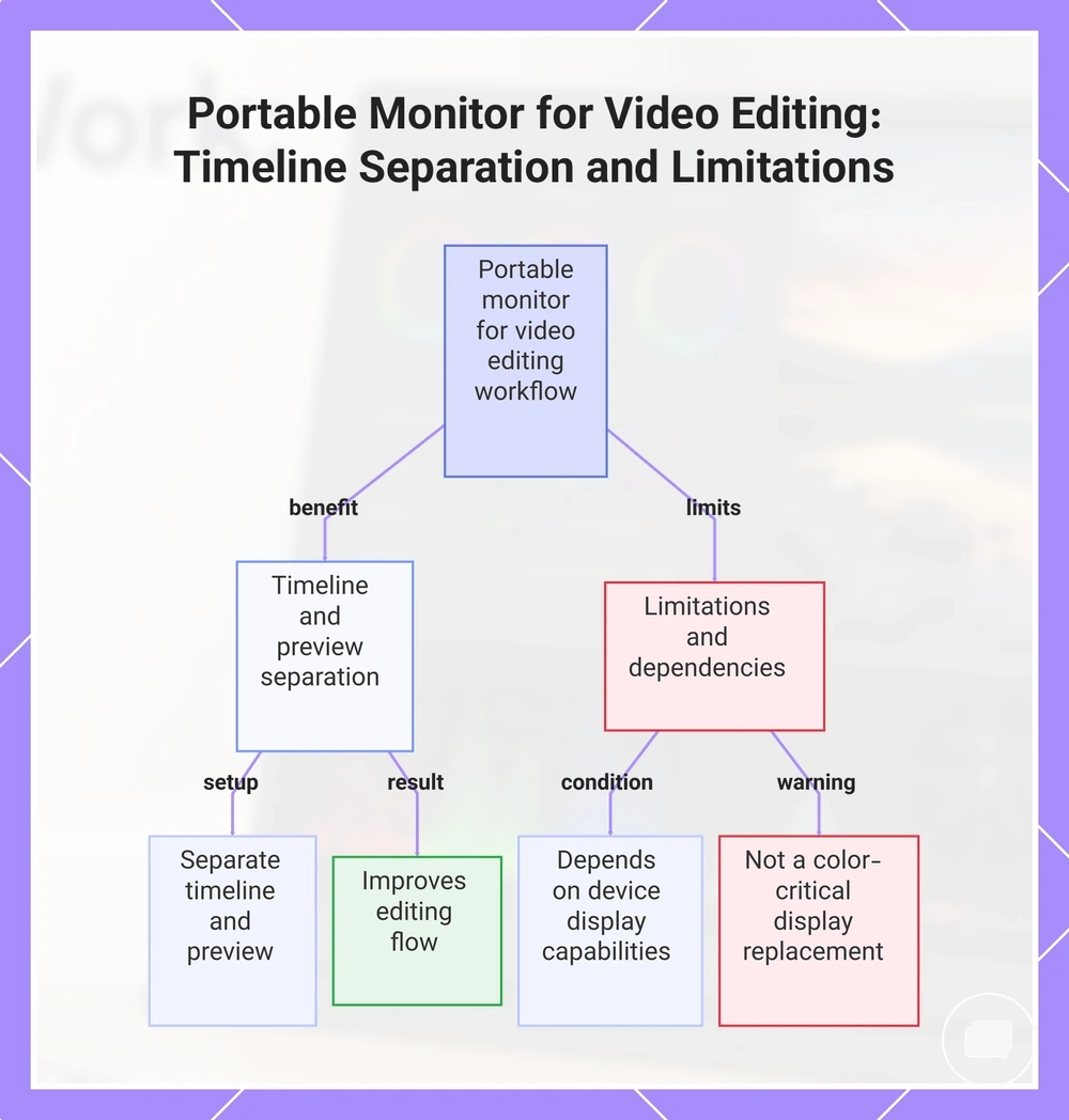
Video editing and timeline workspace often benefits from a portable monitor by separating the editing timeline from the preview screen, giving laptop editing more room for footage review and tool separation. Keeping timeline panels on one display and preview placement on another can improve editing flow, although the result depends on the available screen space and device output constraints. This arrangement is most useful when timeline separation supports a clearer editing workflow.
Preview quality may vary with brightness, resolution, refresh stability, and the source device's display capabilities, so the viewing experience depends on the editing setup. A portable monitor can support on-location footage review and preview management, but colour review limits mean it should not be treated as a replacement for specialised colour-critical displays. This section focuses on workflow support for video editing rather than gaming performance or a complete video production workstation.
For example, a laptop can display timeline panels and editing tools while a portable monitor shows the preview screen, making footage review easier without repeatedly switching between editing panels.
This chart shows how a portable monitor supports video editing by separating the timeline and preview screens, along with key limitations such as display dependency and color review limits.
Display quality requirements for colour-sensitive work
Display quality matters most when creative decisions depend on colour trust rather than simply adding another screen. Portable monitor attributes such as panel behaviour, colour gamut, colour accuracy, brightness, contrast, viewing angles, screen finish, and calibration support can influence how consistently colours appear under real working conditions. These attributes provide the framework for evaluating display quality requirements for colour-sensitive work.
Specification claims need condition-based interpretation because display performance can vary with ambient light, viewing position, calibration, and the connected device. A wider colour gamut or higher brightness may improve usability in suitable conditions, but usable colour consistency still depends on how the display performs during real creative work. Display quality requirements for colour-sensitive work become easier to compare when each attribute is linked to the creative decision it supports, as shown below.
Marketing specifications describe potential display capabilities, but they do not automatically translate into reliable colour trust during everyday creative work. Usable consistency depends on panel behaviour, viewing conditions, and calibration support rather than any single specification. For broader display-quality guidance beyond this section, see portable monitor colour and panel quality.
| Attribute | Useful condition | Creative effect | Decision signal |
|---|---|---|---|
| Colour gamut | When broader colour coverage is relevant | May improve colour representation | Match the display to the creative task |
| Colour accuracy | When supported by consistent calibration | May improve colour trust | Look beyond specification claims |
| Brightness | Ambient light conditions | Can improve screen visibility | Choose for the intended environment |
| Contrast | Balanced viewing conditions | May improve detail separation | Assess using real creative content |
| Viewing angles | Changing viewing positions | Can help maintain consistency | Consider panel behaviour during use |
| Screen finish | Reflective or bright environments | May influence perceived clarity | Select for the workspace conditions |
| Calibration support | When repeatable colour checks matter | Can improve long-term consistency | Useful for ongoing colour-sensitive work |
Colour accuracy, gamut, and Delta E claims
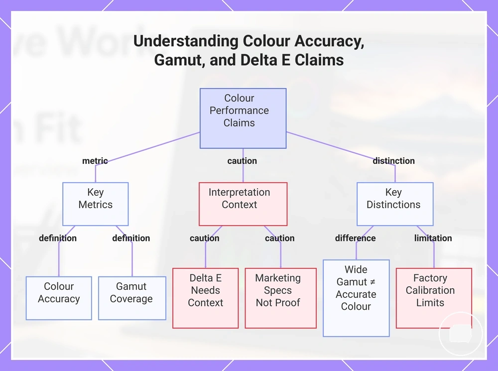
Colour accuracy, gamut coverage, and Delta E describe different display characteristics that help evaluate a portable monitor for colour-sensitive work. Colour accuracy refers to how reliably colours are reproduced, while gamut coverage describes the range of colours a display can represent. Delta E may provide an indication of colour precision, but factory calibration and published values should be interpreted in context rather than treated as proof of real-world performance.
Wide colour and accurate colour are not interchangeable. Broader gamut coverage can increase the available colour range, but it does not by itself indicate reliable colour accuracy because panel behaviour, factory calibration, viewing conditions, and display setup can all influence the final result. Marketing specifications can help compare displays, but they should be considered alongside practical colour consistency rather than accepted as conclusive evidence.
Colour accuracy, gamut, and Delta E claims are easier to understand when each term is interpreted separately.
- sRGB: A common colour space often used for general digital content and web-focused creative work.
- DCI-P3 and Adobe RGB: Wider colour spaces that may be relevant when a workflow benefits from broader gamut coverage.
- Delta E: A measurement associated with colour difference that may help evaluate colour precision when supported by appropriate testing.
- Factory calibration: A manufacturer calibration process that may improve initial colour consistency but does not by itself guarantee long-term colour accuracy.
- Wide colour versus accurate colour: A wider gamut expands the available colour range, but it does not automatically mean reliable colour accuracy.
This chart explains the key colour metrics, the context needed to interpret Delta E and marketing specs, and the important distinction between wide gamut and accurate colour.
Calibration and screen-to-screen colour consistency
Calibration and screen-to-screen colour consistency help reduce visible differences when a portable monitor is paired with a laptop display or another primary screen. Even when both displays show the same content, colour matching can vary because panel behaviour, ICC profiles, colour management, brightness, and viewing conditions differ. Matching expectations should remain conditional because identical results across every display combination are not guaranteed.
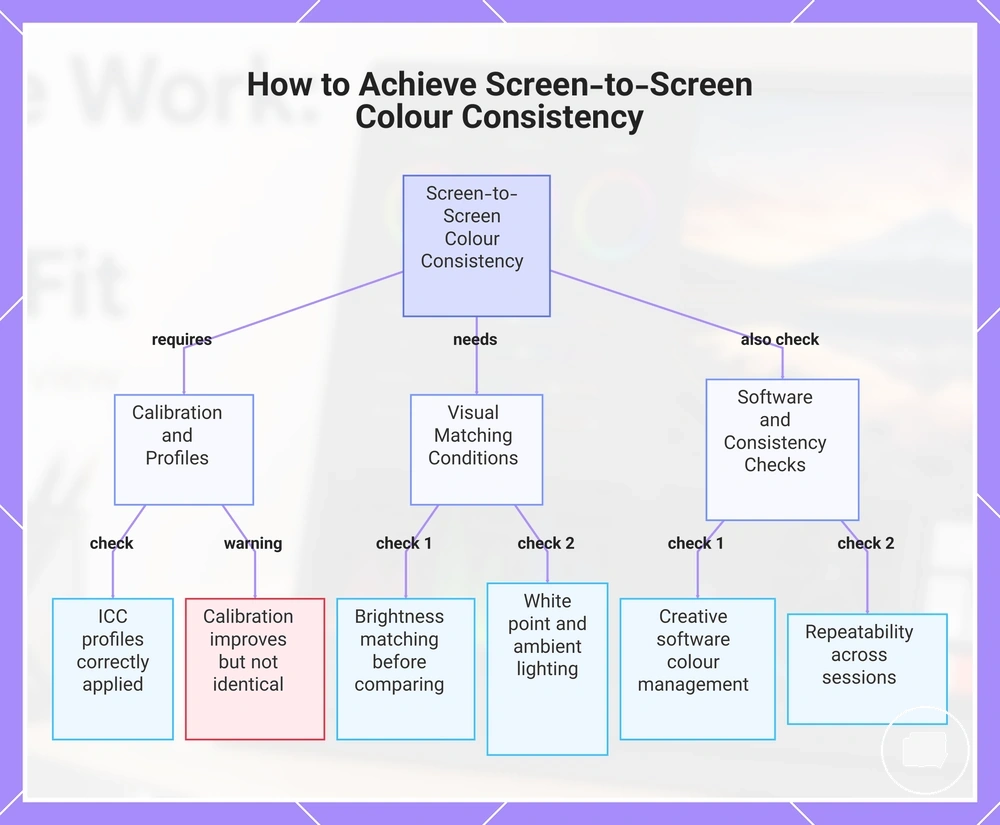
Calibration can improve screen-to-screen colour consistency, but it does not guarantee identical output across all devices, operating systems, or creative applications because profile support and colour management may vary. Brightness matching, white point, ambient lighting, and repeatability can all influence how closely paired displays appear over time. A client preview may only require broadly similar presentation, while colour-critical editing often benefits from closer calibration and controlled viewing conditions. The following checklist highlights the main factors that influence practical display matching.
- Confirm that ICC profiles are available and correctly applied where colour management is supported.
- Check brightness matching before comparing colours between the laptop display and the portable monitor.
- Use a similar white point when a closer visual match is important.
- Evaluate displays under stable ambient lighting to reduce perceived colour differences.
- Check whether creative software uses operating-system colour management where appropriate.
- Review repeatability across multiple sessions instead of relying on a single comparison.
This chart outlines the key factors and checks for matching colours between a portable monitor and a laptop display.
Brightness, contrast, and viewing conditions
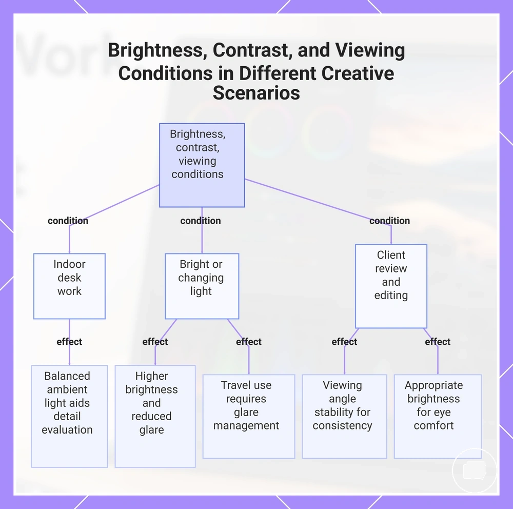
Viewing conditions directly affect how usable a portable monitor feels for creative work because ambient light changes screen visibility and perceived image quality. Brightness, often expressed in nits, and contrast influence how comfortably details remain visible under different lighting conditions rather than delivering the same experience in every environment. Their practical value depends on the conditions in which the display is used.
Glare can reduce visual comfort and make shadow detail harder to judge, particularly in brighter surroundings. A matte finish may help reduce reflections, while a glossy finish may produce more noticeable reflections depending on ambient light. Viewing angle stability can also influence how consistently the image appears during client review or when changing viewing positions. Brightness, contrast, and viewing conditions together determine how reliable the display feels for creative use in different scenarios.
- Indoor desk work: Balanced ambient light can make brightness, contrast, and shadow detail easier to evaluate.
- Bright rooms: Higher brightness and reduced glare may improve screen visibility, although results still depend on ambient light and screen finish.
- Travel use: Changing light conditions can affect viewing comfort, making brightness and glare management more important.
- Client review: Viewing angle stability can help maintain a more consistent image when multiple people view the display.
- Long editing sessions: Appropriate brightness and comfortable viewing conditions may support eye comfort during extended creative work.
This chart shows how brightness, contrast, and viewing conditions impact portable monitor usability across five common creative work scenarios.
Resolution and screen size for creator workflows
Resolution and screen size work together to shape the usable workspace on a portable monitor for creator workflows. A higher resolution can increase display detail, but the practical benefit also depends on screen size, pixel density, scaling, and the connected device. The most suitable choice comes from balancing workspace fit, UI readability, and portability rather than assuming more pixels are always provide a better creative experience.
When resolution increases on a smaller screen, scaling may become necessary to keep UI readability comfortable. Scaling can improve usability, but it may also reduce the additional workspace that a higher-resolution display appears to provide. Canvas detail, pixel density, device output capability, and power demand should therefore be considered together because laptop support and display output can influence the overall experience. The comparison below shows how resolution and screen size combine to shape usable workspace for creator workflows.
Higher resolution is not automatically the better option for every creator workflow. In many cases, 1080p is enough for general creative work on smaller portable monitors, while 2.5K or 4K may provide additional display detail when the workflow benefits from it and the device output capability can support the output comfortably. For broader guidance beyond this workflow-focused comparison, see portable monitor resolution.
| Resolution and size factor | Creative benefit | Trade-off | Best-fit condition |
|---|---|---|---|
| 1080p on smaller screens | Comfortable UI readability with practical workspace | Less canvas detail than higher resolutions | When portability and general creator workflows are the priority |
| 2.5K middle ground | More display detail while maintaining usable workspace | Benefits depend on screen size and scaling | When balancing workspace fit with readability |
| 4K detail | May provide greater canvas detail and higher pixel density | May require scaling and suitable device output capability | When detailed creative work benefits from additional display detail |
| Scaling | Can improve UI readability | May reduce the practical workspace advantage | When interface elements become difficult to read comfortably |
| Device output capability | Supports the intended display configuration | Results depend on laptop support and power demand | When confirming compatibility with the intended workflow |
1080p, 2.5K, and 4K detail trade-offs
1080p, 2.5K, and 4K each involve different trade-offs for creator workflows rather than offering a universally better choice. The right resolution depends on how display detail, screen size, scaling, performance load, power demand, and creative task suitability work together. Comparing these factors provides a more practical decision than comparing resolution alone.
Higher resolution can provide more display detail, but smaller screens may require scaling to keep interface elements comfortable to use. As resolution increases, performance load and power demand may also rise depending on the connected device and its capability. Resolution should therefore be matched to the intended workflow instead of pixel count alone. The comparison below shows how 1080p, 2.5K, and 4K detail trade-offs vary according to scaling, screen size, and device power, with brief examples such as photo detail checks, design canvas work, and video timeline or preview use.
| Resolution tier | Strength | Trade-off | Best creative fit |
|---|---|---|---|
| 1080p | Comfortable readability with lower performance load | Less display detail than higher resolution tiers | General creative work where screen size and readability are the priority |
| 2.5K | Balances additional detail with practical scaling | Benefits depend on screen size and device capability | Design canvas work and mixed creator workflows |
| 4K | Provides the highest display detail and pixel density | May require more scaling, higher performance load, and greater power demand | Photo detail checks or video preview tasks when the connected device can support the workload |
Workspace, scaling, and portable screen dimensions
Workspace depends on portable screen dimensions and scaling rather than resolution alone. The same resolution can provide a different experience depending on diagonal size, aspect ratio, UI panel density, and text readability. Evaluating these factors together makes it easier to judge how scaling and screen dimensions affect everyday creative work.
A portable monitor with a different diagonal size or aspect ratio may change how comfortably editing panels, creative tools, and content fit on screen even when the resolution stays the same. Operating-system scaling can improve text readability, although it may also reduce the amount of visible layout room. Physical desk space and portability should also be considered because they influence how comfortably a display fits into a creative setup. For example, the same resolution may feel more spacious on one portable screen size than another because scaling behaviour and UI panel density change the available working area.
Check workspace, scaling, and portable screen dimensions together before choosing a display:
- Choose a diagonal size that suits both the available workspace and the physical desk space.
- Consider how the aspect ratio affects layout room for creative applications and supporting panels.
- Review operating-system scaling to balance text readability with available workspace.
- Check whether UI panel density leaves sufficient room for the main creative canvas.
- Balance portability with the physical footprint required for your usual creative setup.
IPS, OLED, and 4K portable monitor trade-offs
IPS, OLED, and 4K portable monitor choices solve different creative problems rather than representing a single upgrade path. IPS and OLED describe panel type, while 4K describes resolution, so the right comparison depends on creator workflows rather than headline specifications. The table below compares IPS, OLED, and 4K portable monitor trade-offs as different display choices for creative work.
| Option | Main advantage | Trade-off | Better fit |
|---|---|---|---|
| IPS | Stable colour behaviour, brightness, and viewing angles | May offer lower contrast than OLED | Colour review, design work, and general creator setups |
| OLED | Strong contrast and visual depth | Burn-in considerations, brightness behaviour, and price pressure may affect suitability | Video preview and creative work where contrast is a priority |
| 4K resolution | Higher display detail for supported workflows | May increase power demand and depend on device capability | Detail-focused creator tasks when higher resolution is useful |
| Mixed-feature considerations | Balances panel type with resolution for the intended workflow | No single combination suits every creator setup | Task-based choices for travel use, budget-sensitive setups, and mixed creative work |
IPS, OLED, and 4K should not be treated as identical display choices because panel type and resolution describe different characteristics. IPS and OLED mainly influence contrast, colour behaviour, brightness, viewing angles, and burn-in considerations, while 4K changes display detail. Colour review, design work, video preview, travel use, and budget-sensitive creator setups may each favour a different balance.
Choosing a portable monitor becomes easier when panel type, resolution, power demand, task suitability, and price pressure are evaluated together instead of by one headline specification. This comparison is a decision aid, not a product ranking, so the better option depends on the creative task and setup constraints.
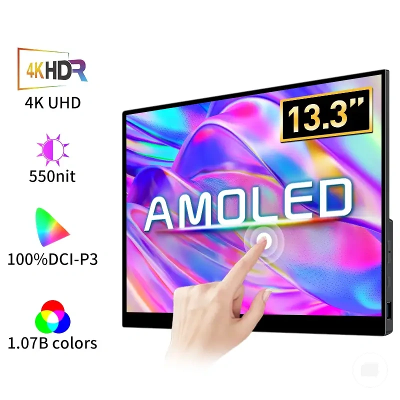
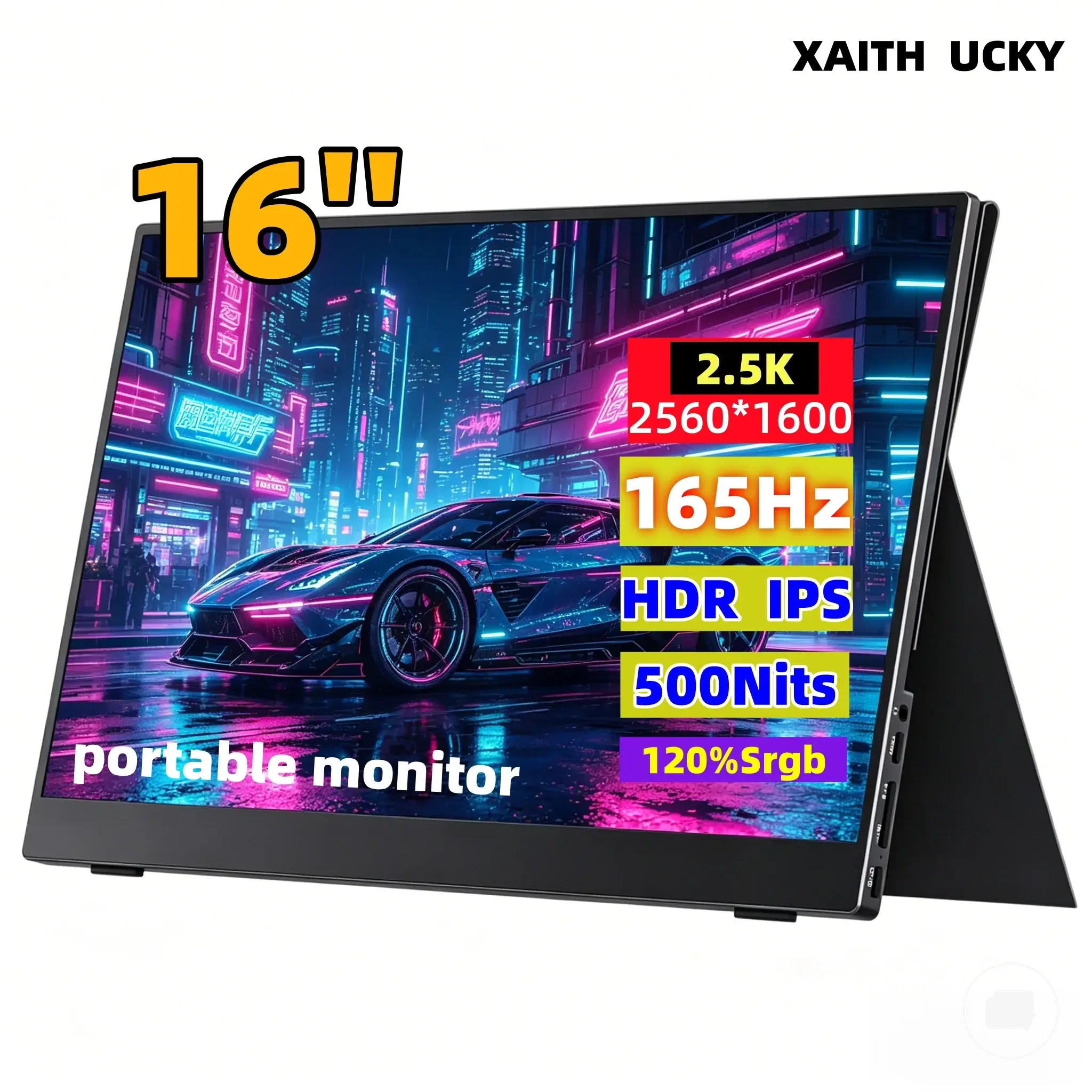
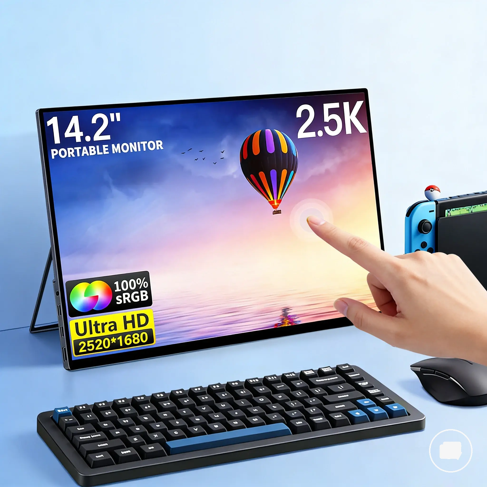
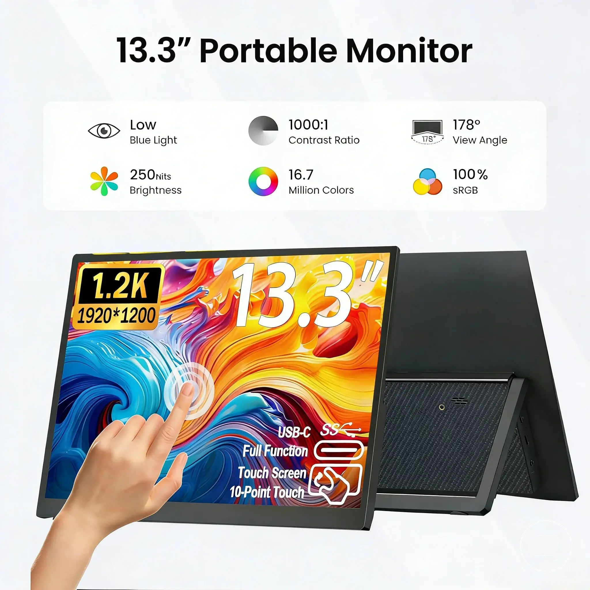
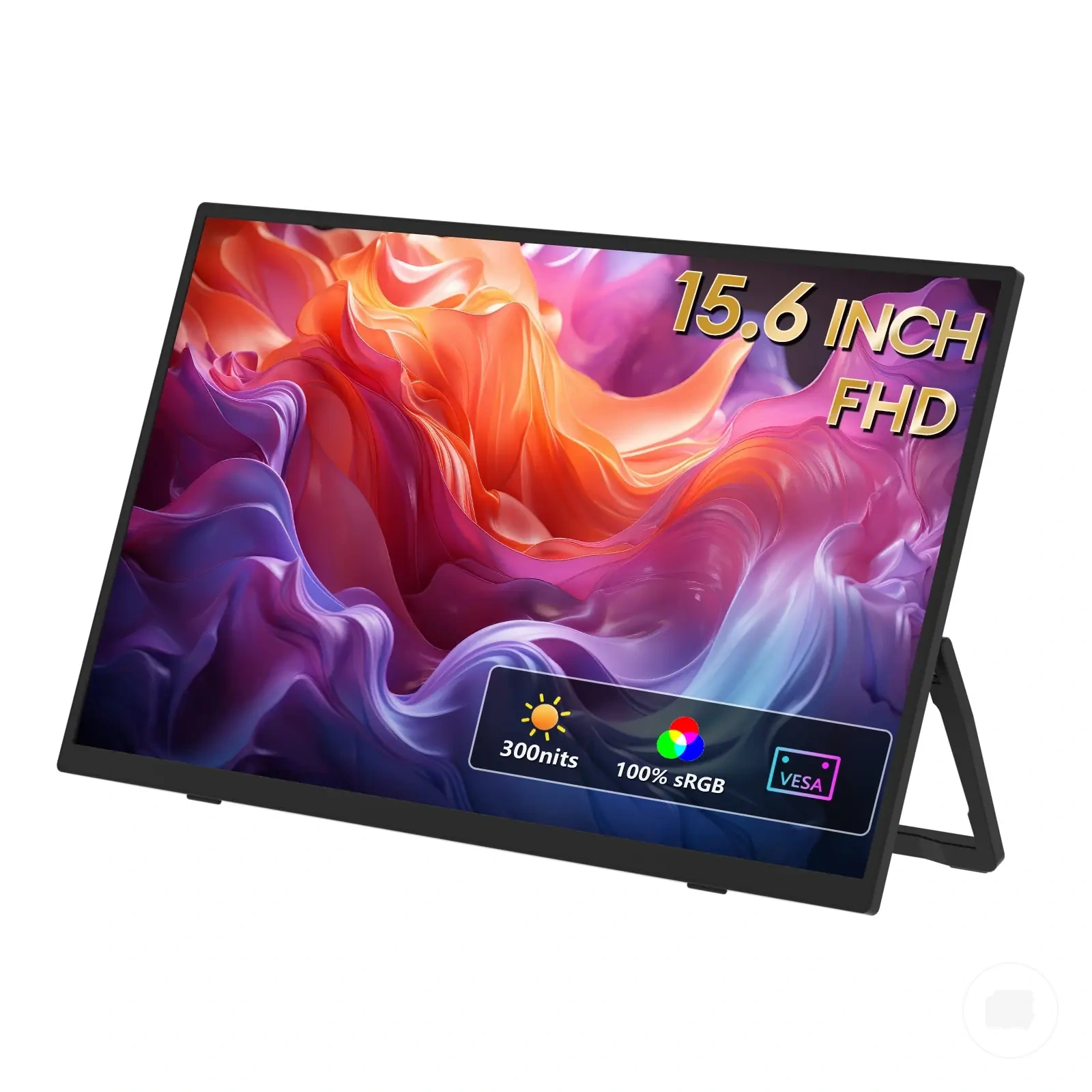
Here are product examples that may make comparison easier. Before buying, always review the compatibility criteria, essential features, and product details.
Device compatibility and setup constraints for creative workflows
Device compatibility can limit a creative portable monitor even when the display specifications appear suitable. A portable monitor may offer the required display features, but the source device must also support the necessary connection, output, power, and software conditions. Device compatibility and setup constraints therefore determine whether the display can be used effectively for creative workflows.
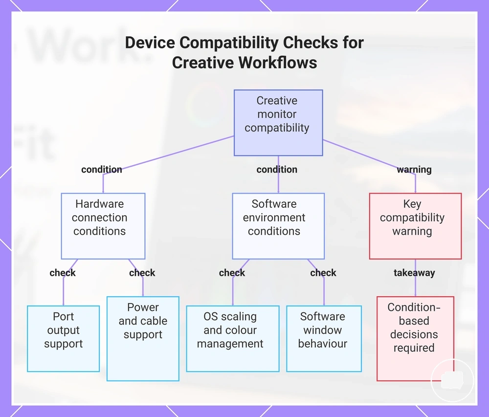
Connection requirements begin with laptop ports, USB-C DisplayPort Alt Mode, HDMI output, power delivery, and suitable cables or adapters. Colour management, operating-system scaling, tablet-adjacent workflows, and software window behaviour can also influence how reliably creative applications perform across multiple displays. Device compatibility and setup constraints for creative workflows are easier to assess when device, cable, power, and software conditions are checked together, as outlined below.
- Verify that the laptop ports support the intended display output.
- Confirm USB-C DisplayPort Alt Mode support when using a USB-C display connection.
- Check HDMI output compatibility if the portable monitor relies on an HDMI connection.
- Review power delivery requirements because some devices or displays may need additional power.
- Use cables or adapters that support the required display and power functions.
- Check operating-system scaling so creative applications remain comfortable to use.
- Confirm that colour management is available when colour-sensitive work depends on consistent display behaviour.
- Review software window behaviour and any device-specific limits that may affect multi-display creative work.
Strong display specifications do not guarantee creative workflow compatibility. If the source device cannot provide the required resolution, display output, power, or colour management support, the portable monitor may not perform as expected despite its capabilities. Compatibility decisions should therefore remain condition-based rather than assuming universal output support.
This chart shows the key hardware connection and software environment conditions to verify when using a portable monitor for creative work, along with the important conclusion that compatibility depends on checking all conditions together.
Feature value checks before choosing a creator-focused portable monitor
Feature value depends on workflow needs rather than the number of premium specifications on a creator-focused portable monitor. Paying more may be worthwhile when a feature supports the way creative work is performed. Organising feature value by practical use makes upgrade decisions clearer.
Must-have creator features and nice-to-have upgrades vary with the intended workload. Colour accuracy and calibration support may deserve higher priority for colour-sensitive work, while resolution, panel type, brightness, screen size, ports, stand quality, power needs, portability, warranty, and return confidence depend on the working environment. The value matrix below separates necessary features from upgrades.
| Feature | Why it may matter | When it is worth paying for | When it may be optional |
|---|---|---|---|
| Colour accuracy and calibration support | Supports more consistent creative decisions | Colour-critical editing and design workflows | General reference use |
| Resolution and panel type | Affects display detail and viewing experience | When the workflow benefits from extra detail or specific display behaviour | General creative tasks with modest display needs |
| Brightness and screen size | Influence comfort and workspace | Travel, client presentations, or bright environments | Controlled indoor workspaces |
| Ports, stand quality, and power needs | Support easier setup and daily use | Frequent mobile or multi-device workflows | Fixed desk setups with stable connections |
| Portability, warranty, and return confidence | Can improve long-term buying confidence | Regular travel or higher-value purchases | Occasional or secondary display use |
Colour-critical editing, graphic design, video work, and mobile creative setups often prioritise different features. A colour-focused workflow may place greater value on colour accuracy and calibration support, while frequent travel may increase the importance of portability, ports, and stand quality. The most useful feature combination depends on the creative workload rather than a fixed specification list.
Premium specifications do not automatically create better creative outcomes because upgrade value depends on whether the feature addresses a real workflow need. Reviewing portable monitor feature value can help place feature priorities into a broader buying context before comparing products.
Here are product examples that may make comparison easier. Before buying, always review the compatibility criteria, essential features, and product details.