
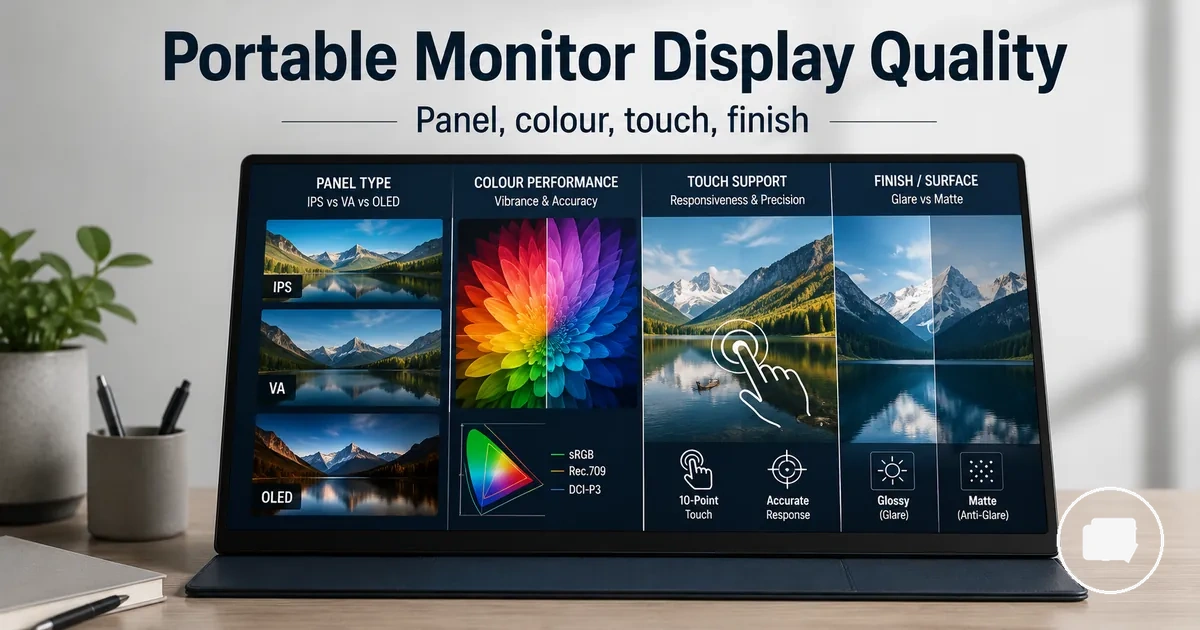
Portable monitor display quality guide
A portable monitor display quality guide is a framework for evaluating how a screen may perform across different viewing conditions and workloads. Display quality depends on the relationship between panel type, colour behaviour, touch layer, and screen finish rather than any single specification. The most suitable combination varies with the intended use, lighting conditions, and connected device.
A portable monitor can use panel type technologies such as IPS, OLED, VA, or TN, and each can influence contrast, viewing angle, motion behaviour, and perceived colour differently. IPS is often chosen when consistent colour and side viewing are priorities for work use. OLED may provide deeper black levels and stronger contrast for media viewing, while VA and TN can represent different trade-offs involving response characteristics, viewing angle, and budget. Resolution and brightness remain important, but they should be assessed alongside panel behaviour rather than in isolation.
Display quality becomes easier to evaluate when each attribute is linked to its practical effect. Panel type influences viewing angle, contrast, and motion behaviour, colour reliability affects how consistently content appears across tasks, a touch layer may change reflections and perceived image clarity, and screen finish can influence visibility under different lighting conditions. Considering these attributes together provides more reliable decision support than relying on a single specification.
What display quality means for a portable monitor
What display quality means for a portable monitor is the combined visual result of how the screen presents images under real viewing conditions. It reflects the interaction between panel behaviour, colour reproduction, clarity, the touch layer, screen finish, and the surrounding viewing environment. Evaluating these attributes together provides a more reliable assessment than relying on a single specification.
What display quality means for a portable monitor becomes clearer when the main attributes are considered as one connected system. Panel type influences contrast, viewing angle, and motion behaviour, while IPS, OLED, VA, and TN panel technologies each introduce different visual characteristics and trade-offs. IPS is often selected for consistent colour and side viewing during work use, OLED may provide deeper black levels for media viewing, and VA or TN can represent different balances between response characteristics and budget. Resolution and brightness also influence the viewing experience, but they follow separate decision logic from overall display quality.
What display quality means for a portable monitor is easier to understand when the main display attributes are viewed together rather than in isolation. The illustration below highlights how panel technology, screen finish, colour behaviour, and viewing conditions combine to influence the overall viewing experience.
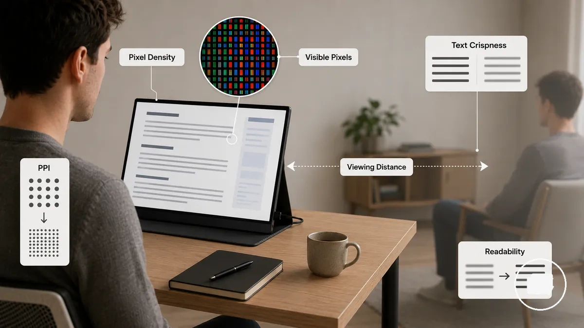
For example, two portable monitors with a similar screen size may appear different because panel technology, reflections from the screen finish, or the presence of a touch layer change how content is perceived under different conditions. For a broader overview of portable monitor selection, see the portable monitor guide. Resolution and brightness remain important considerations, but they should be evaluated alongside the wider display-quality attributes rather than treated as the only indicators of screen quality.
Panel types and picture characteristics
Panel types and picture characteristics describe how display panel technology influences the visual performance of a portable monitor. A panel type affects contrast, viewing angle, colour behaviour, and motion behaviour, although the final viewing experience still depends on panel quality, model, lighting conditions, and intended use. Comparing these characteristics together provides a more reliable basis for evaluation than focusing on a single display specification.
Different panel technologies are designed with different priorities. IPS is often selected for consistent colour and wide viewing angles during work use, while OLED may provide deeper black levels and stronger contrast for media viewing. VA panels can emphasise higher contrast, whereas TN panels may prioritise faster motion behaviour in certain situations. These differences should be viewed as practical trade-offs involving image quality, power use, cost, and workflow rather than fixed advantages.
Panel types and picture characteristics become easier to compare when their visual differences are organised by the attributes that influence everyday use. The illustration below highlights how each panel technology compares across common picture characteristics without suggesting that every implementation performs the same.
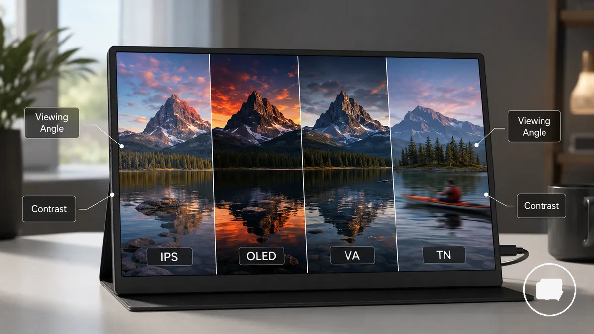
Panel types and picture characteristics can be summarised by linking each panel technology with its typical visual behaviour and the decisions it may support. The comparison below focuses on practical evaluation rather than product ranking.
| Entity/part | Attribute/criterion | Value/condition | Effect/risk/decision |
|---|---|---|---|
| IPS | Colour, viewing angle | Often consistent across wider angles | May suit work tasks where image consistency is important |
| OLED | Contrast, black level | Typically deeper blacks with higher cost | May enhance media viewing when stronger contrast is preferred |
| VA | Contrast | Often higher contrast with viewing-angle trade-offs | Can suit users who prioritise darker scene performance |
| TN | Motion behaviour | May emphasise response characteristics in budget-focused designs | Can suit specific fast-motion use cases when viewing-angle limitations are acceptable |
IPS, OLED, VA, and TN trade-offs
Choosing the right panel type depends on which picture characteristics matter most for the intended use. IPS, OLED, VA, and TN each prioritise different combinations of colour, contrast, viewing angle, motion behaviour, power demand, and price expectations, so the panel type alone does not determine overall display quality. Comparing these trade-offs provides a more practical way to evaluate a portable monitor.
IPS, OLED, VA, and TN trade-offs become easier to interpret when the key attributes are compared together. The comparison graphic below highlights how each panel technology differs across common picture characteristics and why the most suitable option depends on the viewing environment, workflow, and user priorities rather than the panel label alone.
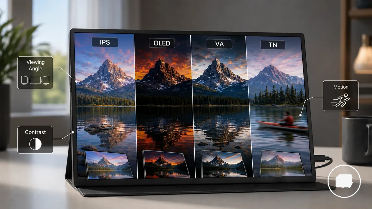
| Option | Attribute | Trade-off | Best use case |
|---|---|---|---|
| IPS | Colour, viewing angle | Often balances consistent colour with wider side viewing and moderate contrast | Work use where colour consistency and viewing angle are priorities |
| OLED | Contrast, black level | May provide deeper blacks while often involving higher cost and different power characteristics | Media viewing where stronger contrast is preferred |
| VA | Contrast | Often emphasises higher contrast with viewing-angle trade-offs | General viewing where darker scene performance is valued |
| TN | Motion behaviour | May prioritise response characteristics over colour consistency and viewing angle | Fast-motion tasks in budget-conscious situations |
Contrast, viewing angles, and motion behaviour
Contrast, viewing angles, and motion behaviour are display attributes that influence how a portable monitor appears during everyday use. These attributes affect the visibility of text, video, and moving content, while the final viewing experience still depends on panel type, panel quality, lighting conditions, and the intended workflow. Assessing them together provides a more reliable basis for judging perceived picture quality.
Contrast, viewing angles, and motion behaviour become easier to compare when each attribute is viewed independently. The annotated example below highlights the display characteristics that most directly influence everyday viewing without repeating the earlier panel-type comparison.
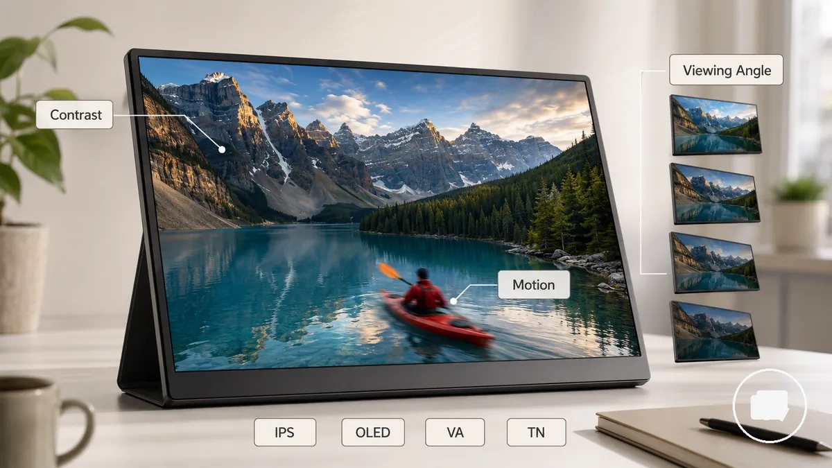
- Contrast: Higher perceived contrast can make light and dark areas easier to distinguish, although the result may vary with panel type, display panel quality, and ambient lighting.
- Viewing angle: A wider viewing angle can help colours and brightness remain more consistent when the screen is viewed from the side, which may improve comfort during shared viewing or flexible work positions.
- Motion behaviour: Motion behaviour influences how moving content appears during video playback or fast on-screen activity, and the experience can differ between IPS, OLED, VA, and TN panel technologies.
- Panel type: IPS often favours colour consistency and side viewing, OLED may emphasise deeper black levels, while VA and TN present different trade-offs depending on response characteristics, budget, and intended use.
Colour accuracy and visual consistency
Colour accuracy and visual consistency are display attributes that describe how reliably a portable monitor reproduces colours across different types of content. Colour accuracy depends on factors such as gamut, factory calibration, colour consistency, and panel behaviour rather than a single specification. Evaluating these attributes together provides a more reliable basis for comparing portable monitor options.
Colour accuracy and visual consistency become easier to assess when the main evaluation criteria are considered together. Metrics such as sRGB and DCI-P3 describe colour gamut, while Delta E and factory calibration may indicate how closely colours match their intended appearance. Colour consistency also affects laptop matching because differences between displays can become more noticeable under changing ambient light or across different panel models. The practical value of each metric depends on the intended workflow rather than a single specification.
Colour accuracy and visual consistency can be organised through the key attributes that influence display comparison. The table below connects common colour-related metrics with their practical meaning and decision effects.
| Metric | What it indicates | Useful condition | Decision limit |
|---|---|---|---|
| sRGB | Common colour gamut coverage | General productivity, editing, and everyday media viewing | Coverage alone does not confirm colour accuracy |
| DCI-P3 | Wider colour gamut | Content that benefits from broader colour reproduction | Value depends on software, source content, and display support |
| Delta E | Colour difference indicator | Useful when supported by measurement or product evidence | Should be considered alongside factory calibration and colour consistency |
| Factory calibration | Initial colour adjustment | May improve purchase confidence | Long-term results can vary with the panel and usage conditions |
| Colour consistency | Uniform colour reproduction across the display | Laptop matching and everyday visual reliability | Ambient light and panel variation can influence perceived results |
For example, a portable monitor with broad gamut coverage may still appear different from a laptop display if colour consistency or calibration differs between the two screens. Users whose primary focus is dedicated creative workflows may benefit from guidance tailored to a portable monitor for creators, while colour accuracy remains a central comparison factor for general display selection.
sRGB, DCI-P3, Delta E, and factory calibration
sRGB, DCI-P3, Delta E, and factory calibration are colour-related criteria that help evaluate colour accuracy claims for a portable monitor. Together they organise colour gamut, colour accuracy, and out-of-box readiness, making it easier to judge whether a display is likely to suit everyday work, media viewing, or colour-sensitive tasks. These metrics provide stronger evaluation criteria when considered together rather than as isolated specifications.
sRGB, DCI-P3, Delta E, and factory calibration describe different aspects of colour performance. The table below organises what each metric indicates, the situations where it may be most useful, and the decision limits that help prevent overinterpreting individual specifications.
| Metric | What it indicates | Useful condition | Decision limit |
|---|---|---|---|
| sRGB | Common colour gamut | General work and everyday media viewing | Coverage alone does not confirm colour accuracy or colour consistency |
| DCI-P3 | Wider colour gamut | Content that benefits from broader colour reproduction | Value depends on workflow, source content, and display support |
| Delta E | Colour difference indicator | Useful when supported by measurement evidence | Should be interpreted alongside gamut and factory calibration |
| Factory calibration | Initial colour adjustment | May improve confidence in out-of-box colour accuracy | Long-term results can vary with panel behaviour and usage conditions |
Users seeking closer laptop matching may benefit from evaluating colour consistency alongside these metrics because perceived differences can still vary with the laptop display, ambient light, panel quality, and calibration state. The most reliable comparison considers colour gamut, calibration, and colour consistency together instead of relying on a single metric.
Colour matching for laptops and creative work
Colour matching depends on how closely a portable monitor aligns with the laptop display for the intended task. Colour accuracy is influenced by the colour profile, gamut, factory calibration, colour consistency, and ambient light rather than by a single specification. These connected factors become most important when visual consistency affects editing decisions or confidence in on-screen colours.
Colour matching for laptops and creative work is easier to evaluate by checking the conditions that influence consistency instead of relying on marketing claims. The table below organises the main criteria that affect laptop matching and explains how each attribute supports display comparison while showing its practical limits.
| Metric | What it indicates | Useful condition | Decision limit |
|---|---|---|---|
| Colour profile | How colours are interpreted across displays | Comparing a laptop screen with a portable monitor | Matching also depends on device settings and display support |
| Gamut | Available colour range, including sRGB and DCI-P3 | Media viewing and colour-sensitive work | Coverage alone does not confirm colour accuracy |
| Factory calibration and Delta E | Initial colour adjustment and colour difference indicator | When colour consistency is an important buying criterion | Results may vary with panel quality, model, and continued use |
| Ambient light | Viewing environment | Everyday laptop matching | Lighting conditions can change perceived visual consistency |
For casual productivity or media viewing, small differences between a laptop screen and a portable monitor may be acceptable. Users who need closer laptop matching for creative work should compare colour accuracy, colour consistency, gamut, calibration, and ambient light together because the final result depends on the display combination rather than a single colour metric.
Touchscreen display quality and trade-offs
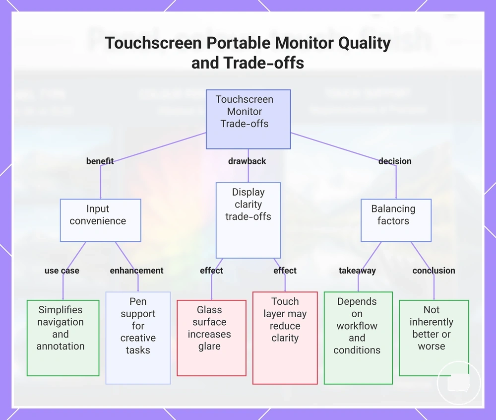
A touchscreen portable monitor is a display that combines visual output with direct touch input through a touch layer or glass surface. This additional layer can improve input convenience, but it may also influence screen clarity, reflections, weight, and overall value depending on the panel design, lighting conditions, and intended workflow. Evaluating these attributes together provides a more balanced basis for choosing between touch functionality and image-quality priorities.
A touchscreen portable monitor should be assessed by considering how the touch layer changes both interaction and display characteristics. A glass surface may increase reflections in brighter environments, while screen finish and panel construction can influence perceived screen clarity. Pen support may improve annotation or drawing workflows when supported by the monitor and connected device. These benefits should be weighed against possible trade-offs in portability, reflectivity, and price rather than assuming touch is inherently better or worse.
- Input convenience: Touch input can simplify navigation, annotation, and interactive applications when compatible device support is available.
- Screen clarity: An additional touch layer may slightly change perceived image clarity depending on the display construction.
- Reflections: A glass surface can increase glare, making lighting conditions and screen finish more important during use.
- Pen support: Pen support may add value for note-taking or creative tasks when compatible hardware and software are used.
For example, users focused on document review or handwritten notes may value the added input convenience of a touchscreen portable monitor, while users who prioritise image quality for media viewing may place greater emphasis on lower reflections and screen clarity. The preferred balance depends on workflow, device compatibility, viewing conditions, portability requirements, and budget rather than touchscreen capability alone.
This chart shows the main attributes and trade-offs of a touchscreen portable monitor compared to image quality, helping readers decide based on workflow and conditions.
Touch layers, pen support, and screen clarity
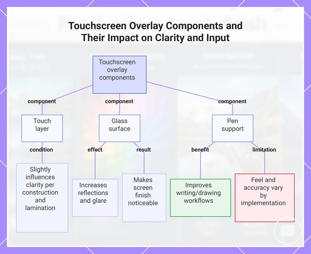
Touch layers, pen support, and screen clarity describe how the hardware above the display influences both image quality and touch interaction in a touchscreen portable monitor. A touch layer and glass surface can improve input convenience, but they may also influence screen clarity, reflections, and writing feel depending on the display design. These components should be evaluated together because similar touchscreen specifications can still produce different visual and input experiences.
Each component contributes differently to usability and perceived image quality.
- Touch layer: An additional touch layer may slightly influence screen clarity depending on the display construction and laminated layers.
- Glass surface: A glass surface can increase reflections or glare under brighter lighting, making the screen finish more noticeable.
- Pen support: Pen support may improve writing or drawing workflows when compatible hardware and device support are available, although writing feel and input accuracy can vary by implementation.
- Overall usability: For example, two touchscreen portable monitors may both support touch input, yet differences in laminated layers or glass construction can make one appear clearer or feel more responsive. The overall trade-off depends on display design, lighting conditions, and the intended workflow.
This chart shows how the touch layer, glass surface, and pen support each influence screen clarity, reflections, and writing feel in portable touchscreen monitors.
When touch input improves or weakens the display choice
Touch input improves the display choice when the intended workflow benefits from direct interaction more than maximum display clarity. A touchscreen portable monitor can increase input convenience for annotation, presentations, or tablet-like control, but the added touch layer, glass surface, reflections, and price may reduce its value for users who prioritise screen clarity. The right decision depends on workflow, device support, screen finish, and price tolerance.
When touch input improves or weakens the display choice becomes clearer by comparing the conditions that influence each outcome. The table below organises the main decision criteria and the display-quality trade-offs associated with each option.
| Entity/part | Attribute/criterion | Value/condition | Effect/risk/decision |
|---|---|---|---|
| Touchscreen portable monitor | Input convenience | Frequent annotation, presentations, or tablet-like interaction | Touch input may improve workflow efficiency |
| Touch layer | Screen clarity | Additional display layer | Perceived sharpness may vary with the display design |
| Glass surface | Reflections | Bright lighting or glossy screen finish | Glare may become more noticeable during use |
| Pen support | Writing workflow | Compatible hardware and device support | May improve note-taking or drawing, although the benefit depends on how often a stylus is used |
| Non-touch display | Display value | Image quality is a higher priority than touch interaction | May provide a more suitable balance when touch features are unnecessary |
Screen finish and reflection control
Screen finish determines how a portable monitor balances reflections with perceived image quality. Matte, glossy, and semi-glossy finishes each influence glare, perceived contrast, sharpness, and viewing comfort differently, so the most suitable option depends on the lighting environment and intended use. Comparing these trade-offs provides a more reliable basis for selection than treating one finish as universally superior.
Matte finishes often reduce visible glare and improve comfort in brighter room lighting, although they may introduce slight grain that can affect perceived detail. Glossy finishes may produce a clearer appearance with stronger perceived contrast, but reflections can become more noticeable when bright light reaches the screen. Semi-glossy finishes may balance reflection handling with image clarity, although results can vary by screen coating and panel design. Display brightness and lighting conditions can influence how a finish performs, but they do not replace the role of screen finish in reflection control.
Screen finish and reflection control become easier to compare when each surface condition is linked to its practical effects. The comparison below connects the main finish options with their viewing characteristics and everyday trade-offs.
| Option | Attribute | Trade-off | Best use case |
|---|---|---|---|
| Matte | Reflection handling | Often reduces glare but may introduce slight grain | Brighter rooms or frequent travel |
| Glossy | Perceived sharpness and contrast | May provide a clearer appearance while making reflections more noticeable | Controlled indoor lighting |
| Semi-glossy | Balanced surface finish | May balance reflection control with image clarity | Mixed lighting conditions |
| Surface finish | Cleaning and travel usability | Fingerprints, cleaning effort, and day-to-day handling can vary by finish | Users who regularly carry a portable monitor |
Matte, glossy, and semi-glossy surfaces
Matte, glossy, and semi-glossy surfaces differ in how they balance reflection handling with perceived image clarity. Each screen finish changes glare, perceived sharpness, surface texture, and visibility in different ways, so the most suitable option depends on room lighting and everyday use rather than the finish type alone. Comparing these surface finishes by their trade-offs provides a practical basis for choosing between them.
Matte, glossy, and semi-glossy surfaces become easier to compare when each finish is linked to its visual characteristics and everyday effects. The table below organises the main surface attributes and the trade-offs that may influence display choice.
| Option | Attribute | Trade-off | Best use case |
|---|---|---|---|
| Matte | Low-reflection surface finish | Often reduces glare but may introduce slight grain that can soften perceived sharpness | Bright rooms or frequent travel |
| Glossy | Smooth reflective surface | May enhance perceived colour pop and sharpness while making reflections and fingerprints more noticeable | Indoor desks with controlled room lighting |
| Semi-glossy | Balanced screen coating | May balance reflection handling with image clarity, although results can vary by coating and panel design | Mixed lighting conditions and general-purpose use |
For example, a glossy finish may appear clearer in controlled indoor lighting, while a matte finish can improve viewing comfort where reflections are more noticeable. A semi-glossy finish provides an intermediate option for users who want to balance glare control with perceived image detail, although the final experience depends on the display design and lighting conditions.
Glare, grain, sharpness, and room lighting
Glare, grain, sharpness, and room lighting are visual attributes that determine how a screen finish performs in everyday viewing conditions. A matte, glossy, or semi-glossy finish changes reflection handling and perceived image clarity differently, so the viewing experience depends on both the surface finish and the surrounding environment. Considering these factors together provides a more reliable basis for comparing screen finishes without treating any single option as universally suitable.
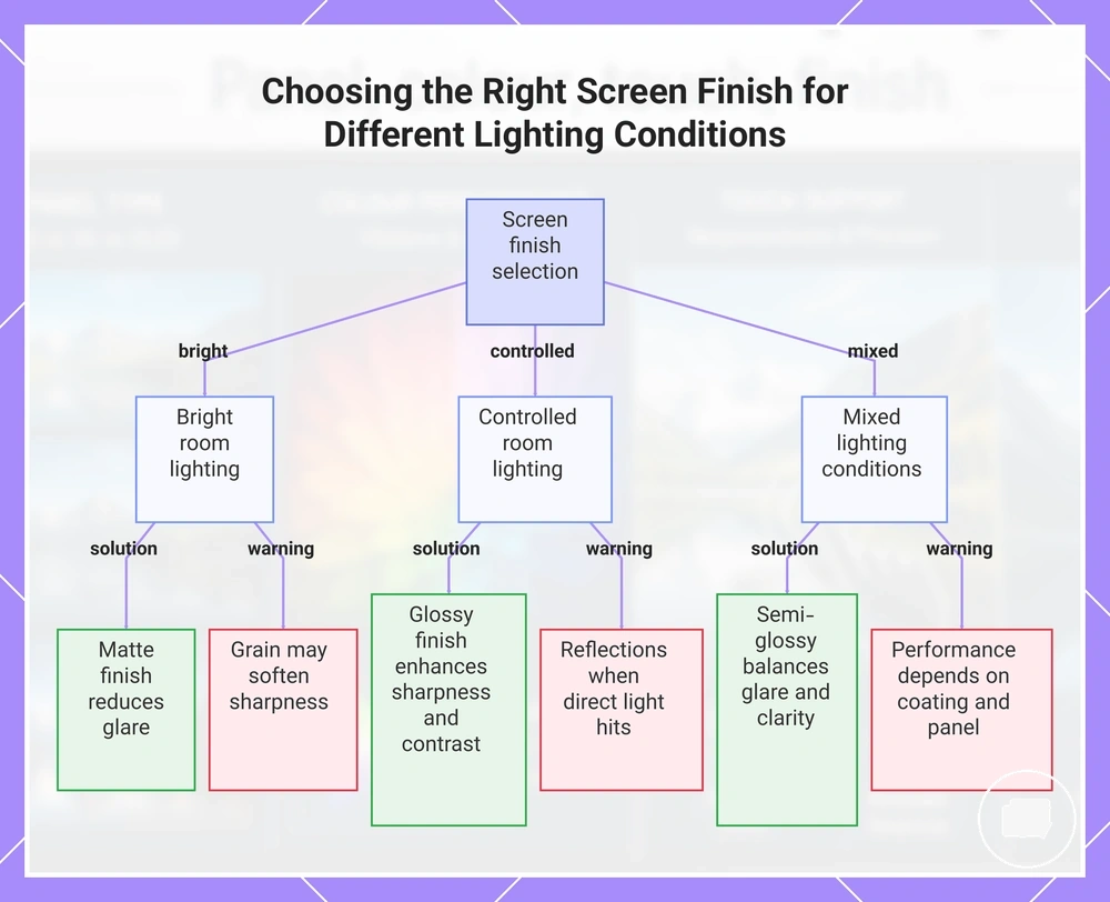
Each component influences visual comfort in a different way. Matte finishes often reduce glare in brighter room lighting, although a light grain effect may slightly soften perceived sharpness on detailed content. Glossy finishes may produce stronger perceived colour pop and edge definition, but reflections can become more noticeable when direct light reaches the display. Semi-glossy finishes may balance reflection handling with image clarity, although the result depends on the screen coating, panel design, and lighting conditions. The main trade-off is between reducing reflections and maintaining the desired level of perceived detail.
- Bright environments: Matte finishes can improve visibility and viewing comfort by limiting reflected light.
- Controlled room lighting: Glossy finishes may provide higher perceived sharpness and contrast when reflections remain limited.
- Mixed lighting: Semi-glossy finishes can offer a balance between glare control and perceived image clarity.
- Related consideration: If display brightness is also part of the decision, portable monitor brightness explains how brightness and screen finish work together under different lighting conditions.
This chart compares matte, glossy, and semi-glossy screen finishes across three typical lighting environments, showing the best choice and its main trade-off.
Display quality criteria by use case
Display quality criteria by use case depend on how and where the portable monitor will be used. The most suitable display attributes change with work style, viewing environment, and visual sensitivity rather than a single specification. Comparing decision criteria by scenario helps match display features to practical expectations instead of assuming one display profile suits everyone.
User situation influences which display attributes deserve the highest priority. For office work, readability, reduced glare, and viewing comfort may matter more than maximum colour gamut. During travel, changing lighting, portability, and screen finish can affect everyday usability. Display quality criteria by use case are easier to apply when each scenario is connected to a practical decision effect.
| Entity/part | Attribute/criterion | Value/condition | Effect/risk/decision |
|---|---|---|---|
| Office work | Readability and glare control | Comfortable viewing conditions | May improve long-session comfort depending on room lighting |
| Travel | Screen finish and portability | Changing lighting environments | Reflection handling and carrying convenience may become higher priorities |
| Shared spaces | Viewing angles | Displays viewed by more than one person | Wider viewing consistency may improve shared visibility |
| Photo editing and media | Colour accuracy and contrast | Greater emphasis on colour consistency | Display choice may depend on editing expectations and workflow |
| Gaming | Motion behaviour | Fast-moving content | Motion performance may become a higher decision criterion than colour alone |
| Touch use | Touch layer and finish | Interactive workflows | Touch convenience may involve trade-offs in reflections or screen appearance |
Creative tasks such as photo editing and media viewing often place greater emphasis on colour accuracy, contrast, and consistency, while gaming may shift attention toward motion behaviour and responsiveness. In shared spaces, viewing angles can become more important because multiple people may look at the display from different positions. These priorities can overlap, so the preferred balance depends on the primary use case rather than one display attribute.
Touch interaction and screen finish introduce additional decision criteria that may matter more for certain workflows than others. A touchscreen may improve productivity for annotation or presentations, while a matte or semi-glossy finish may better suit frequent travel or brighter environments. Users focused mainly on media viewing may instead prefer different visual characteristics, depending on lighting conditions and personal preference.
Choosing display quality by use case is usually more effective than comparing specifications individually because each attribute contributes differently to real-world viewing. Consider which display characteristics support everyday work, travel, creative tasks, or entertainment before deciding which trade-offs are acceptable for your situation.
The products below are useful examples for comparing available options. Before buying, check that the compatibility criteria, key features, and product details match your needs.
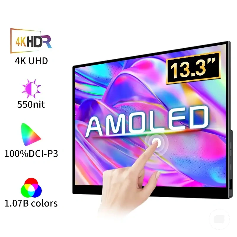
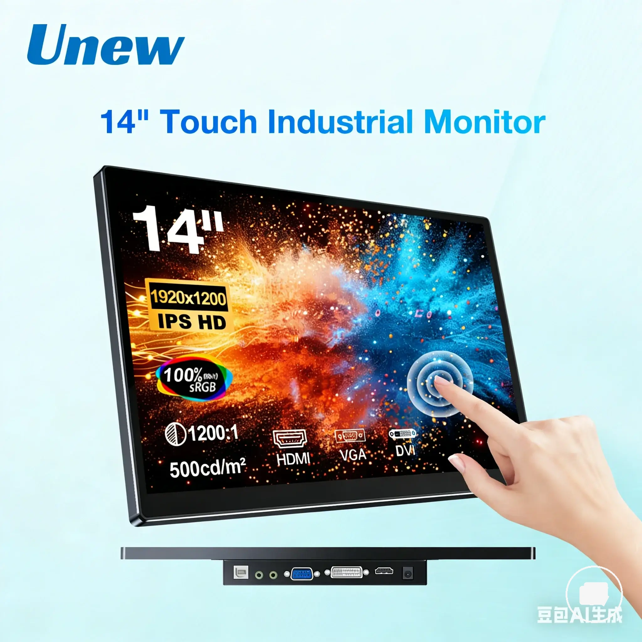
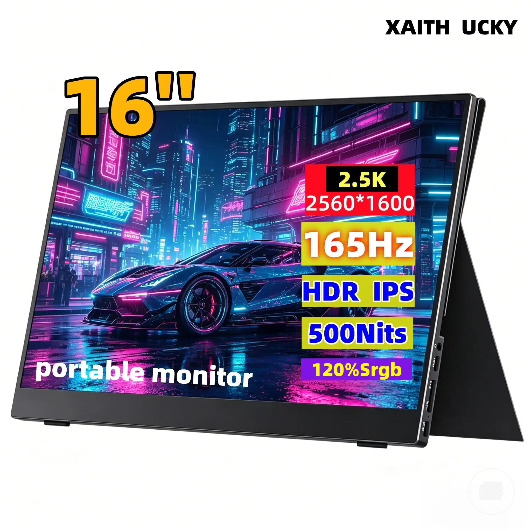
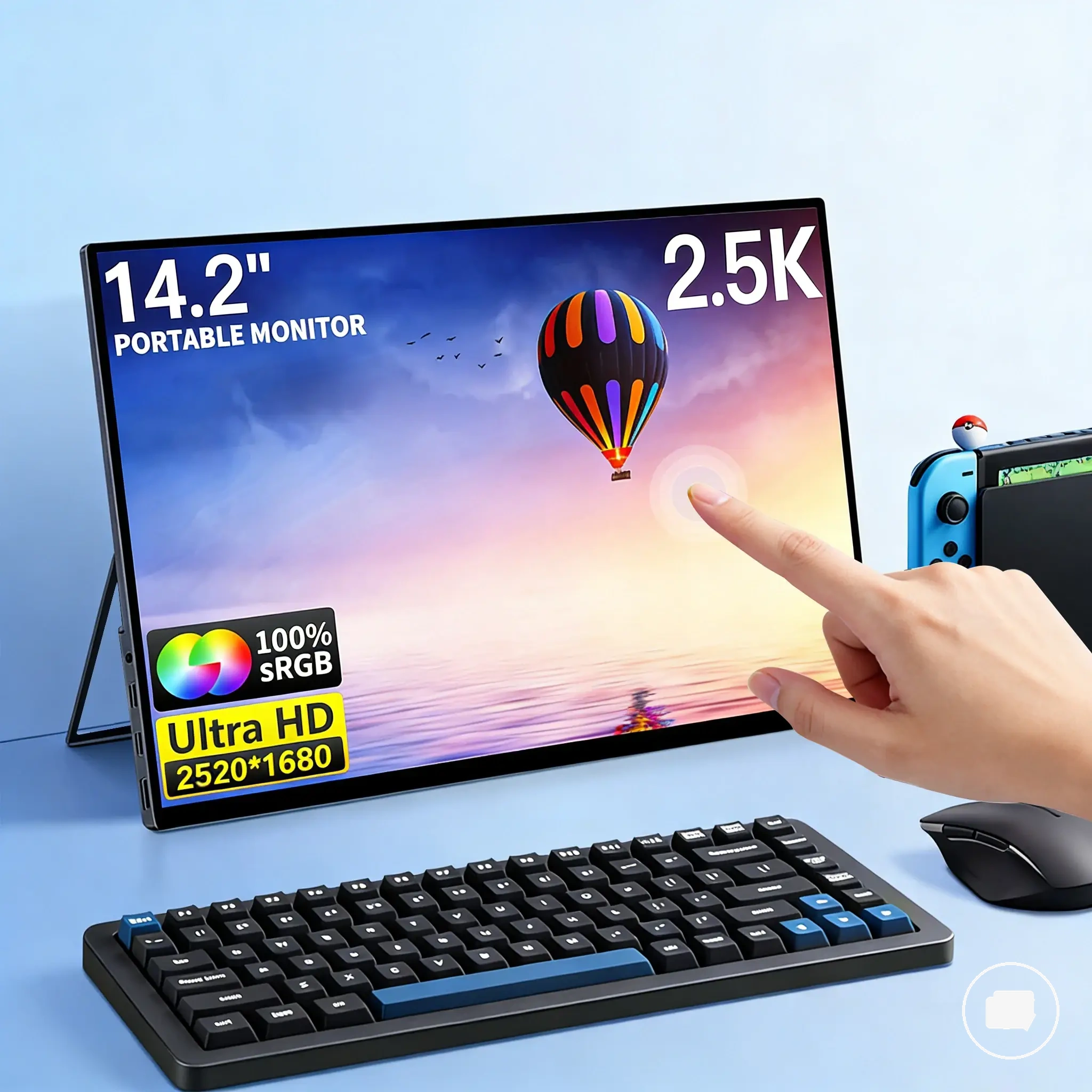
Office work, travel, and shared spaces
Office work, travel, and shared spaces each create different display-quality priorities for a portable monitor. The most suitable use case depends on matching the display attribute to the viewing environment instead of relying on a single specification. User situation determines which decision criteria deserve the greatest attention before choosing a display.
The following checklist compares common viewing contexts with the display attributes that may matter most. The effect of each attribute can vary with panel quality, lighting, and workflow, so the main trade-off is choosing the characteristics that fit the primary use case.
- Office work: Prioritise readability, viewing comfort, and glare control when documents or spreadsheets are the primary focus.
- Travel: Prioritise portability, screen finish, and visibility under changing lighting conditions.
- Shared spaces: Prioritise viewing-angle consistency when multiple people may view the display at the same time.
- Photo editing, media, and gaming: Decision criteria may shift toward colour accuracy, contrast, or motion behaviour depending on the viewing expectation and workflow.
For example, a monitor used mainly in a fixed office environment may benefit from different display priorities than one carried between temporary workspaces. Likewise, users in shared spaces may value consistent side viewing, while photo editing, media, or gaming can place greater emphasis on different display attributes. The most appropriate balance depends on the primary viewing context rather than a universal display profile.
This chart shows how the primary use case—office work, travel, or shared spaces—determines which display attributes to prioritize for a portable monitor.
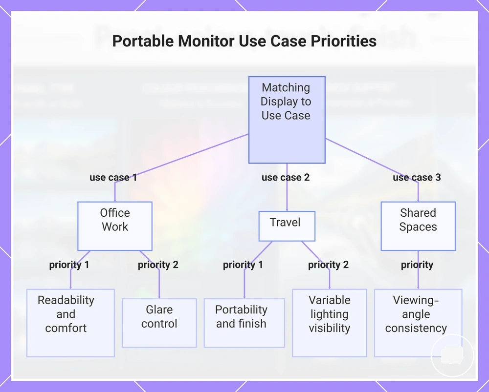
Photo editing, media, and gaming expectations
Photo editing, media, and gaming expectations depend on matching display attributes to the primary use case rather than relying on a single specification. Photo editing may place greater emphasis on colour accuracy, media viewing often benefits from balanced contrast and image appearance, and gaming may prioritise motion behaviour. Photo editing, media, and gaming expectations become easier to compare when each activity is evaluated against the display attributes that influence the viewing experience.
The comparison below organises the decision criteria for these activities and shows how different display attributes can influence the overall viewing experience. The importance of each criterion depends on panel quality, lighting conditions, workflow, and user expectations.
| Entity/part | Attribute/criterion | Value/condition | Effect/risk/decision |
|---|---|---|---|
| Photo editing | Colour accuracy | Consistent colour reproduction | May support more reliable visual adjustments when colour consistency is important |
| Media | Contrast | Balanced light and dark detail | Can improve perceived image depth depending on the display and viewing conditions |
| Gaming | Motion behaviour | Smooth handling of moving content | May reduce distracting motion artefacts depending on the panel and displayed content |
| Display finish | Reflection control | Screen finish matched to the viewing environment | May influence viewing comfort across photo editing, media, and gaming use cases |
For example, a user focused on photo editing may accept different display trade-offs than someone who mainly watches media or plays games. Office work, travel, and shared spaces can also influence the final decision because lighting, portability, and viewing conditions may change which display attribute deserves the highest priority.
Display quality checks before choosing a portable monitor
Display quality checks before choosing a portable monitor should verify evidence before comparing specifications or marketing claims. A structured checklist helps separate measurable display attributes from features that may depend on model, workflow, or viewing conditions. This approach can reduce buying risk by focusing on evidence rather than promotional wording.
Display quality checks before choosing a portable monitor become more reliable when each specification is matched with supporting evidence. The table below organises the main attributes to verify before comparing options and explains how each one can influence confidence or trade-offs.
| Entity/part | Attribute/criterion | Value/condition | Effect/risk/decision |
|---|---|---|---|
| Panel | Panel type | Specifications clearly identify the display technology | Clear evidence can improve comparison confidence |
| Colour performance | Colour evidence | Gamut, calibration, or other supporting specifications are provided | Missing evidence may increase uncertainty around marketing claims |
| Touch display | Touch layer | Touch capability matches the intended workflow | Added functionality may involve a trade-off in price or screen characteristics |
| Screen finish | Reflection control | Finish matches expected lighting conditions | Appropriate selection may improve viewing comfort while involving different visual trade-offs |
| Marketing claims | Evidence check | Claims are supported by measurable specifications | Evidence-backed claims generally provide a stronger buying signal than promotional wording alone |
Use the checklist to compare features in the same order rather than evaluating specifications individually. A higher price does not always indicate higher value, so verify whether each cost driver is supported by relevant evidence and whether the claimed benefit matches the intended use case.
Before comparing options, review this portable monitor checklist to confirm that the key display attributes have been verified consistently. Completing these evidence checks can improve decision confidence by reducing buying risk and keeping attention on measurable specifications instead of unsupported marketing claims.
The products below are useful examples for comparing available options. Before buying, check that the compatibility criteria, key features, and product details match your needs.
Specifications that matter more than marketing claims
Specifications that matter more than marketing claims depend on how clearly they connect to measurable display outcomes. Specifications supported by evidence usually provide stronger decision confidence than broad promotional labels because they describe identifiable display attributes rather than general impressions. Marketing claims can still be useful when they are backed by verifiable information, but unsupported wording may increase buying risk. The table below organises which specifications deserve closer verification before comparing price and value.
| Entity/part | Attribute/criterion | Value/condition | Effect/risk/decision |
|---|---|---|---|
| Display panel | Panel specifications | Clear technical specifications are provided | Evidence can improve decision confidence when the feature relates to display performance |
| Colour performance | Colour evidence | Claims are supported by measurable specifications or calibration information | Missing proof may increase uncertainty about real-world value |
| Feature claim | Marketing claims | Benefit is explained with supporting evidence | Qualified claims provide a stronger buying signal than unsupported labels |
| Purchase decision | Trade-off | Price matches verified features and buyer fit | Comparisons become more reliable when value is based on evidence rather than promotional wording |
Condition should guide the evaluation instead of marketing language alone. A feature that increases price may still represent good value when its benefit is supported by evidence and matches the intended workflow, while a vague claim without verification may add buying risk. As a practical boundary, compare display specifications alongside portable monitor resolution so that individual attributes are interpreted within the wider display context rather than in isolation.
Feature trade-offs that affect price and value
Feature trade-offs that affect price and value depend on whether added components match the intended use case. A higher price may reflect upgraded panel specifications, colour-related features, touch capability, screen finish, or build quality, but those additions do not automatically provide better value for every buyer. Evidence, specifications, and workflow should guide the comparison instead of marketing claims alone. Feature trade-offs that affect price and value become easier to evaluate when each added feature is linked to its practical benefit and buyer fit.
| Entity/part | Attribute/criterion | Value/condition | Effect/risk/decision |
|---|---|---|---|
| Display panel | Panel specifications | Improved panel characteristics supported by evidence | May justify a higher price when the improvement matches the intended use case |
| Colour features | Evidence check | Specifications support the advertised capability | Missing evidence may increase buying risk and reduce decision confidence |
| Touch capability | Cost driver | Interactive features match the workflow | Added convenience may justify the trade-off, while unnecessary features may reduce overall value |
| Screen finish and build | Buyer fit | Surface finish and construction suit the viewing environment | Practical value depends on the intended use case rather than price alone |
Component upgrades should be evaluated by comparing the added cost with the practical benefit they provide. A feature may represent worthwhile value when supported by evidence and aligned with the intended workflow, while unsupported marketing claims or unnecessary upgrades can increase buying risk without improving buyer fit. The main trade-off is selecting specifications that deliver measurable value instead of paying for features that do not support the intended use case.